Creating, innovating and presenting
Data Storytelling + A.I.
2025-07-05
About me

- Francisco Alfaro Medina aka fralfaro
- Member of Python Chile
- Lead Data Scientist at Grupo Security
- Associate Lecturer at UTFSM
Agenda
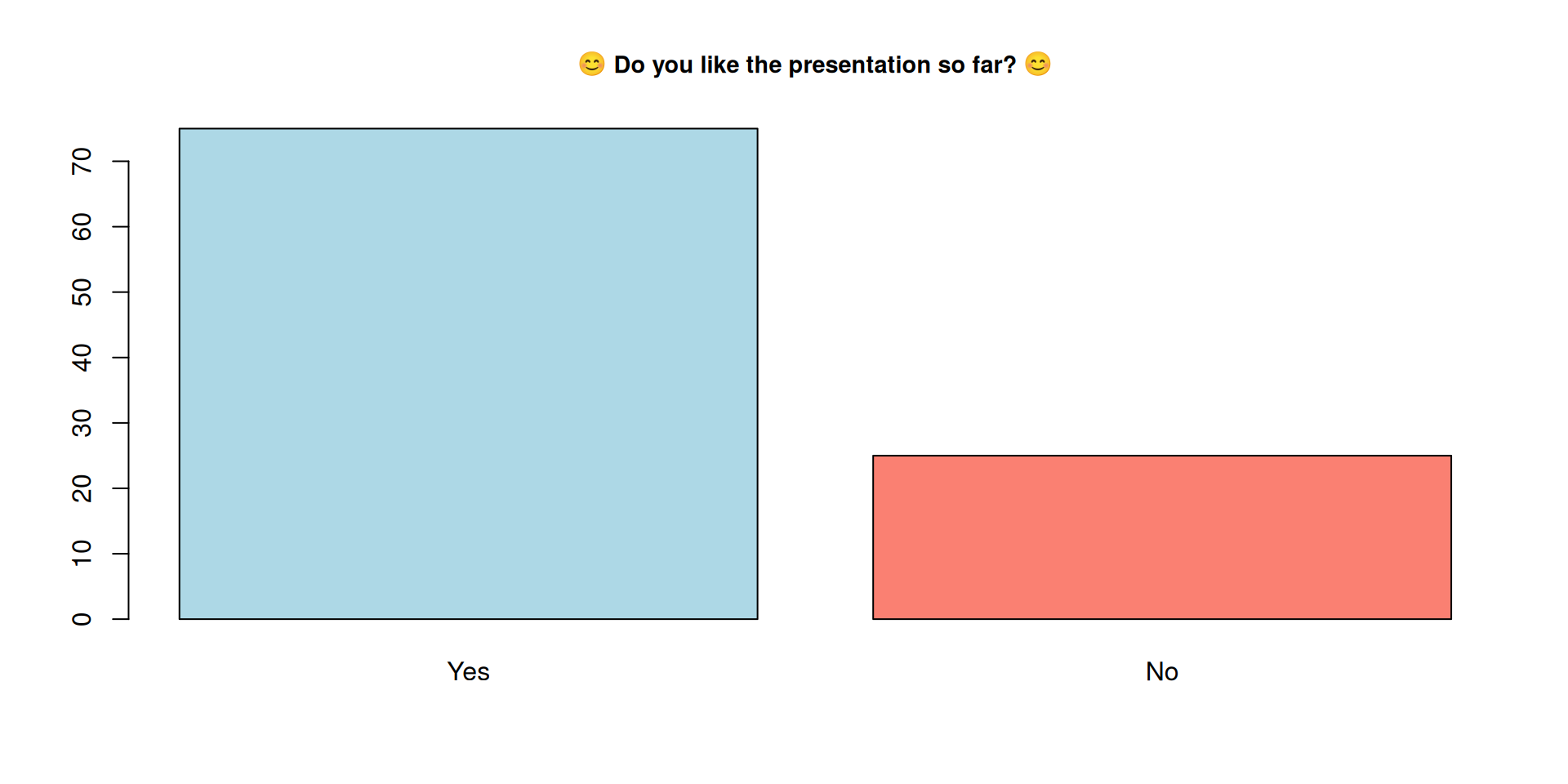
No
Nope
No chance

What is Storytelling?

🔥 Stories are the first human technology.
Ohh, those hackable brains
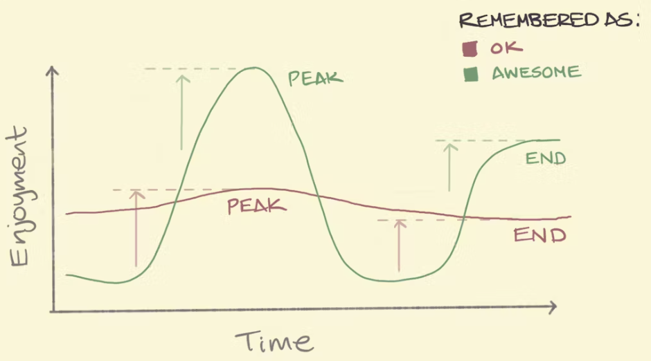
Peak-End Rule
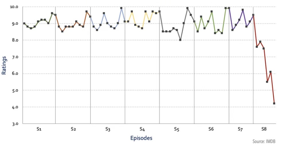
Game of Thrones Rating, by Kelvin Neo
Narrative
Use Storytelling tricks (narrative) to create presentations that will be remembered and make an impact

🎭 Emotions inspire action
The best example
How to make millions of people share statistics on social media?
Examples
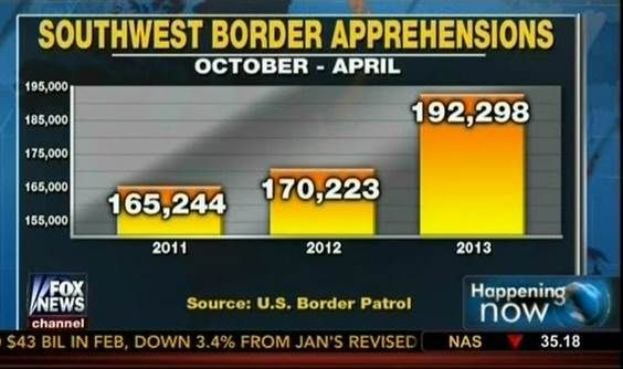
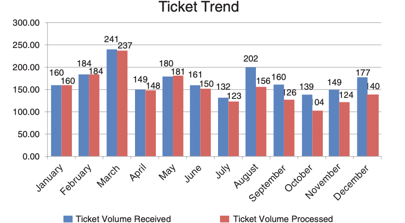
❌ Bad Chart
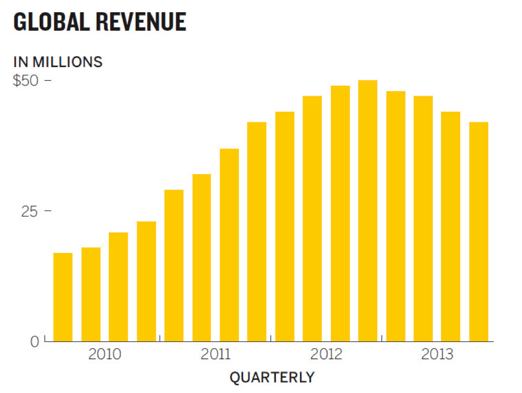
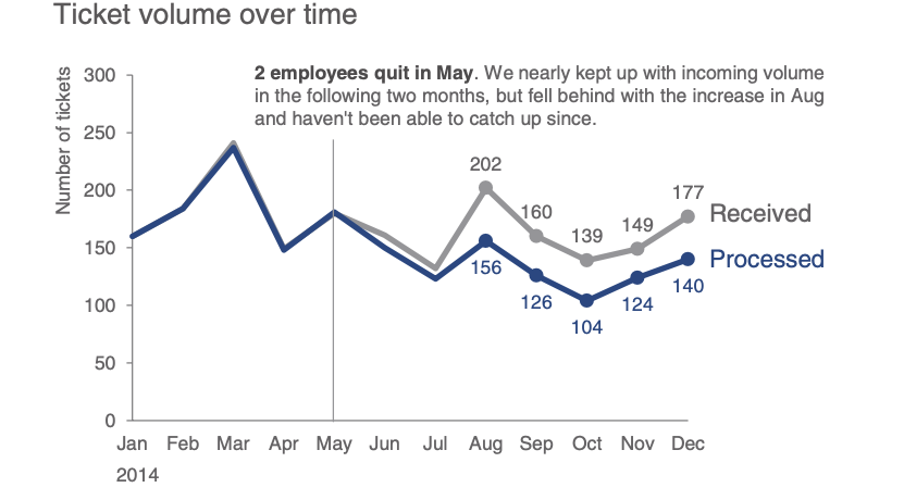
✅ Good Chart
Examples
 🔢 Don’t share numbers
 🪶 Share a story
(C) Storytelling with Data, by Cole Nussbaumer Knaflic.
Best Charts for your Data
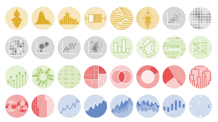
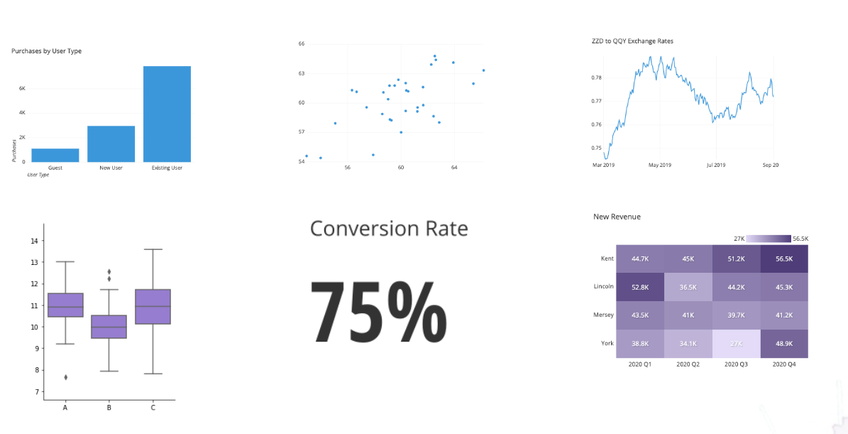
(C) Essential chart types for data visualization, by Atlassian.
Examples


🥱 1° version \(<\) … \(<\) 😊 last version
From Ideas to Impact… Faster with AI
- Faster structure, less effort
- Clearer stories, better impact
- Visuals in seconds
- More time for creativity

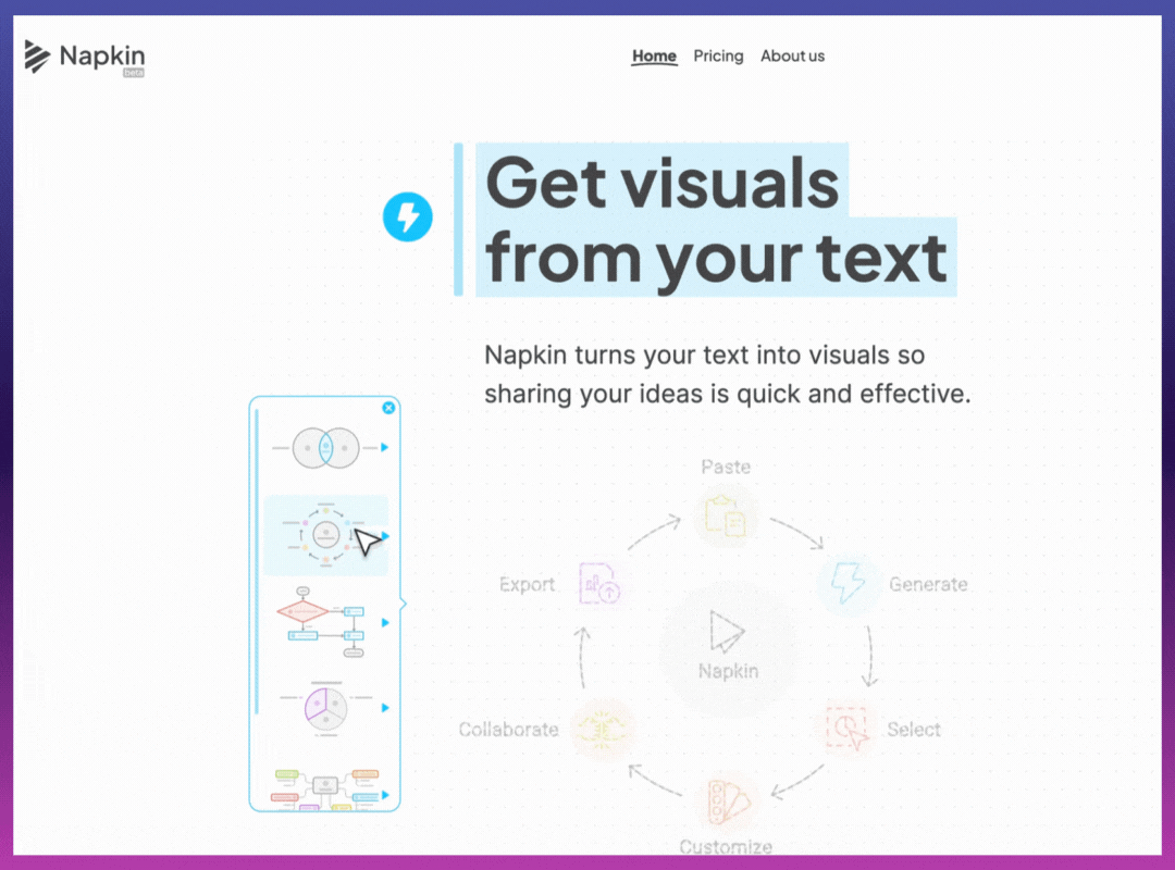
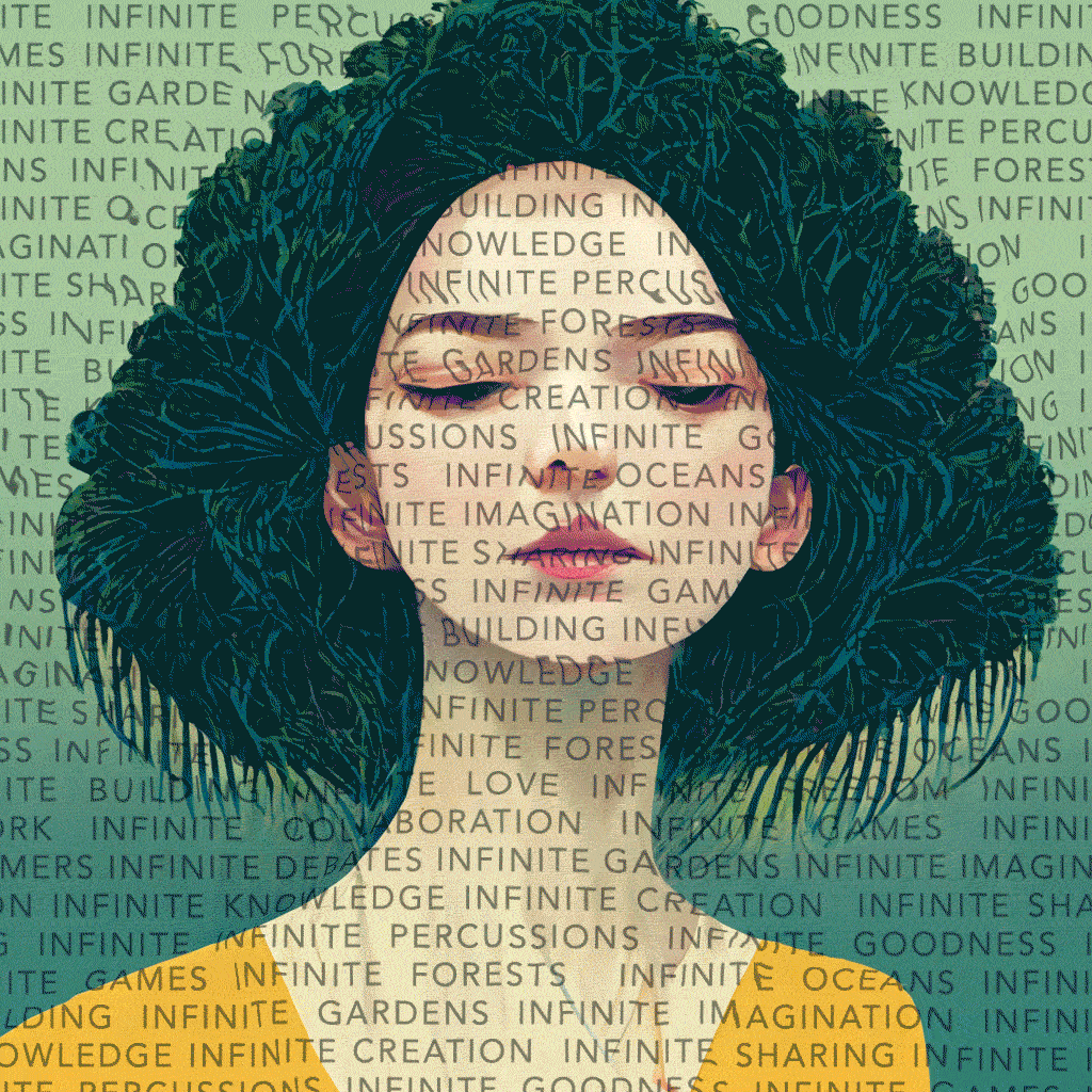
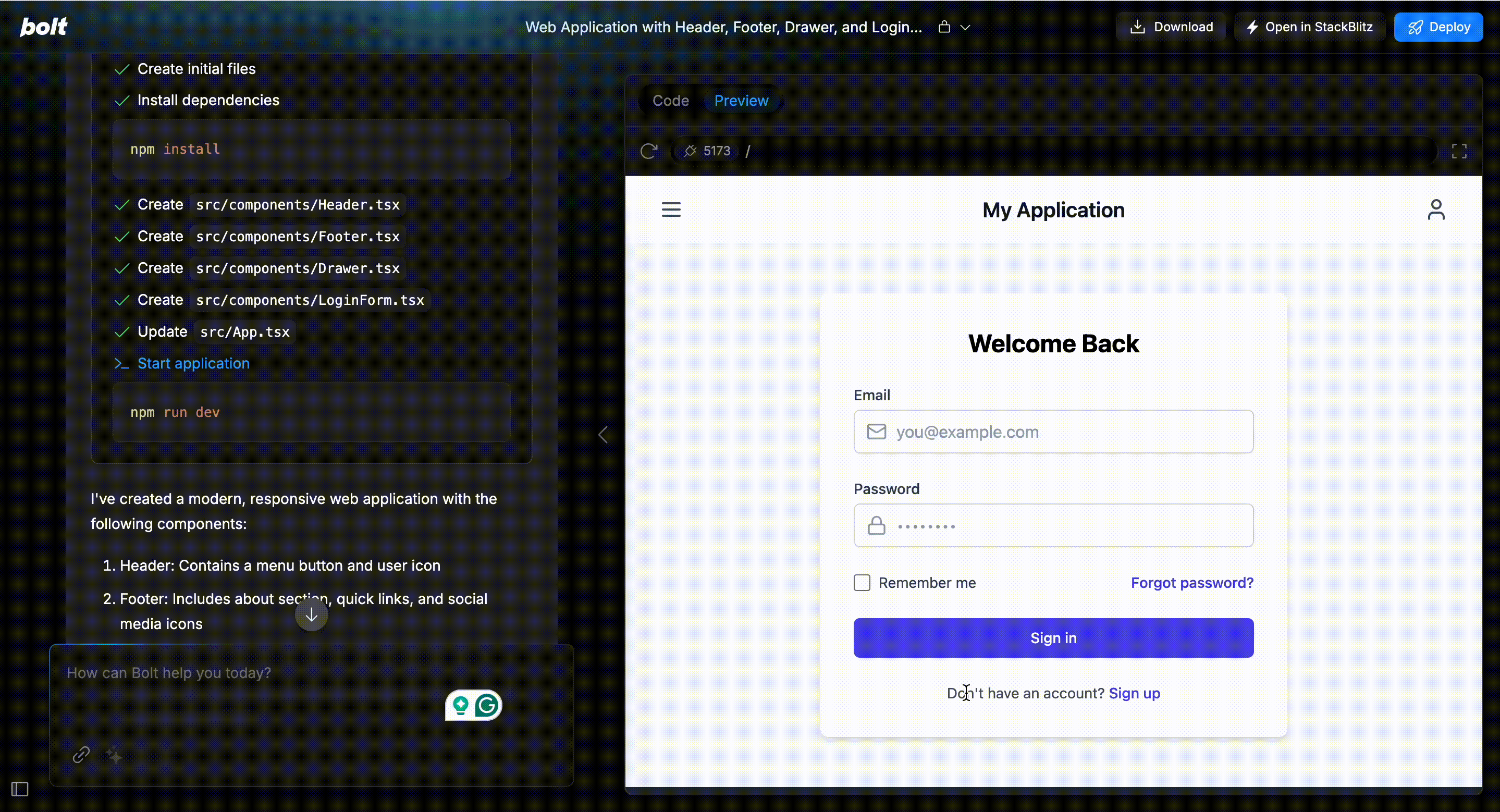
🤖 tools: ChatGPT, Gemini, Napkin AI, Midjourney, Bolt

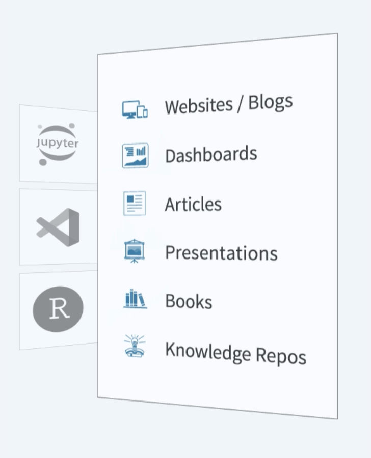
📝 Quarto (+ Extensions)
Quarto is an open system for scientific publications with markdown and interactive code (Python/R).
🔧 Need more power? Use Extensions
🌐 Quarto WebR + Pyodide
Streamlit
Streamlit is a Python library that allows you to easily create interactive web applications using only Python code.

Streamlit

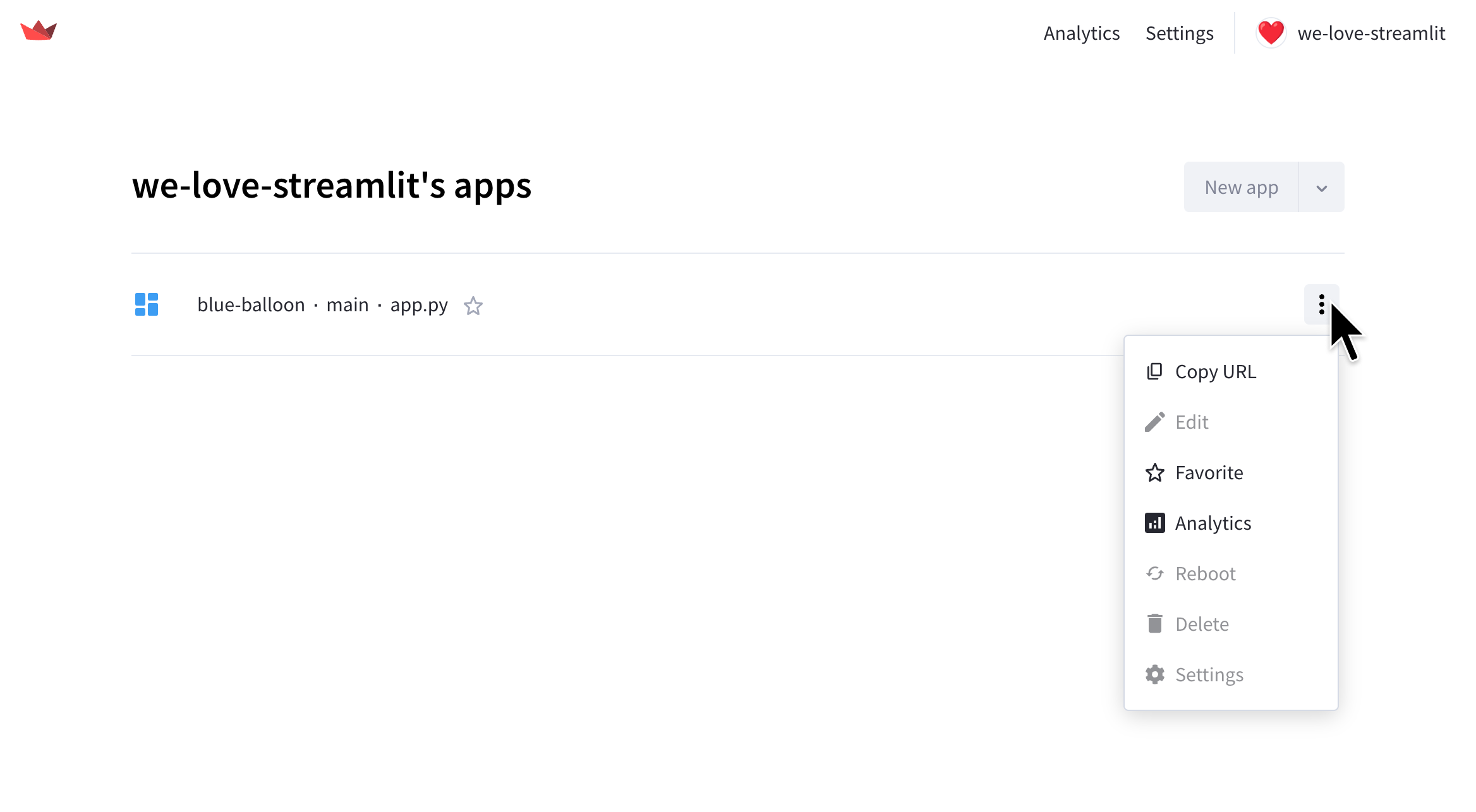
☁️ Streamlit Cloud
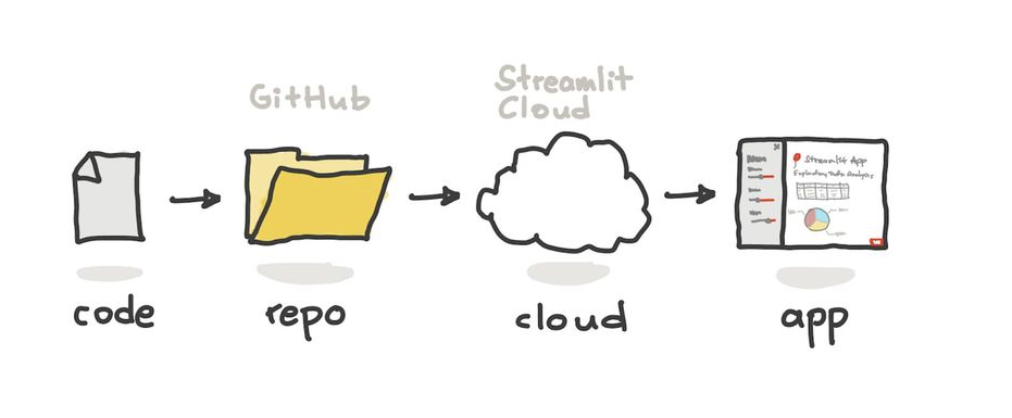
🌐 Quarto + Streamlit
- Deploy to Streamlit Cloud with one click.
- Seamlessly embed your app in a Quarto presentation or website.
- Perfect for live demos and data storytelling.
Stay in your presentation.
Stay in the flow. 🎯
🔗 Useful Links

🎉 Thank You for Participating!

🔗 Visit our official site: sethnut.com/talks